
Trend Analysis
This example can be followed when evaluating trends over time in county data, either from County Health Rankings or from other national, state, or local data sources. In this example, teen birth data (number of births per 1,000 female population aged 15-19) from Brown County in Wisconsin was downloaded from a Wisconsin vital statistics website and used to evaluate the trend over time in the rate of teen births in Brown County.
| 1999 | 2000 | 2001 | 2002 | 2003 | 2004 | 2005 | 2006 | 2007 | 2008 | 2009 | 2010 | |
|---|---|---|---|---|---|---|---|---|---|---|---|---|
| Brown County | 35.5 | 39.6 | 34.3 | 35.8 | 35.3 | 30.7 | 32.7 | 32.6 | 35.9 | 35.9 | 32.2 | 31.7 |
| Wisconsin | 36 | 35.7 | 34.3 | 32.7 | 31.6 | 30.5 | 30.5 | 31.1 | 32.4 | 31.3 | 29.6 | 26.5 |
| United States | 41.1 | 40.54 | 39.73 | 41.09 | 41.46 | 40.24 | 37.93 | 34.25 |
There are not as many years of data for the United States as Wisconsin and Brown County. This is because the data source used for U.S. data does not go back as far as the local source. However, this is not a problem—as long as there are at least five years of data, a trend should be able to be detected.
Step 1: Graph data to visualize the trends
This can be done in many different software packages, but the example below was created in Google Docs, software that is freely available to anyone with an internet connection.
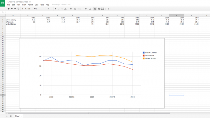
As can be seen in this graphic, the trend teen birth rate in both Wisconsin and the United States has been generally decreasing over the past decade. The trend line for Brown County is far less smooth, but also appears to show an overall decreasing trend.
Depending on the measure, a downward trend may represent an improvement (e.g., for teen birth rate or premature death) or a concern (e.g., for high school graduation rate).
Additional guidance for interpreting trend graphs is available.
Step 2: Quantifying trends
There are a few methods for quantifying these trends. A recommended method is to fit a series of regression lines to the county, state, and national data, and apply tests to determine if the slopes of these lines are statistically different. However, if lack of statistical training or access to a statistician are barriers, a county’s trend and its differences from the state and nation, can be approximated by calculating the percentage change over time.
Using the example data above, it is recommended to first stabilize the estimates by averaging two or more years of data, e.g., averaging the 1999-2000 and the 2009-2010 estimates. The percentage change can then be calculated as follows:
Percentage change for Brown County = (Rate time 2 – Rate time 1)/Rate time 1 = [(31.9-37.6)/37.6] x 100 = -15%
| 1999 | 2000 | 2009 | 2010 | 1999-2000 | 2009-2010 | Percent change | |
|---|---|---|---|---|---|---|---|
| Brown County | 35.5 | 39.6 | 32.2 | 31.7 | 37.6 | 31.9 | -15% |
| Wisconsin | 36.0 | 35.7 | 29.6 | 26.5 | 35.9 | 28.0 | -22% |
This calculation hints that while the rate of teen births in Brown County is decreasing, it may not be decreasing as fast as the rate in Wisconsin as a whole. Note that in this example, the comparable change for the U.S. can’t be calculated because the U.S. data source only goes back to 2003.