
Making the Most of Your Data
County Health Rankings & Roadmaps provides data and related tools—including maps and graphs— to help people understand the health, and what shapes the health, of their community. Learn about the available resources and how to use them below.
Resources beyond 2026
Due to the program’s funding ending in December 2026, we encourage you to take these steps to ensure continued access to CHR&R data:
- Visit our new CHR&R Open Source Project (CHRR-OSP) site. This project contains an archive of CHR&R code from the 2025 Annual Data Release and data dating back to 2010, as well as a community-driven effort to update and extend the data after the program concludes in 2026.
- Download datasets and technical documentation available on our website before the end of the year.
- Download, save, or print graphs and maps from our County and State Health Snapshots.
- Subscribe to the CHR&R newsletter to receive updates.
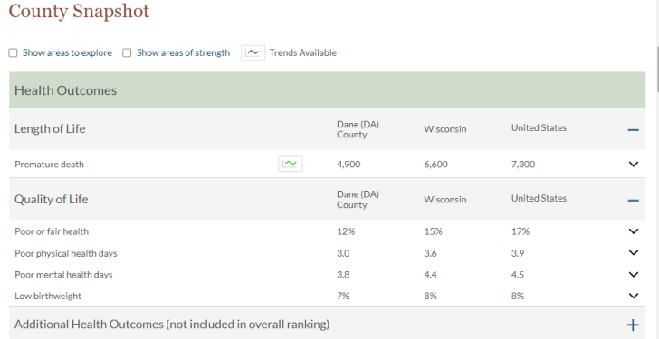
County Health Snapshots
County Health Snapshots house measures of population health and well-being and community conditions based on our model of population health.
County Health Snapshots help make sense of your county's data. The snapshot can help you understand your county's current health, changes over time, and identify areas of strength or opportunities for health improvement.
Health summaries
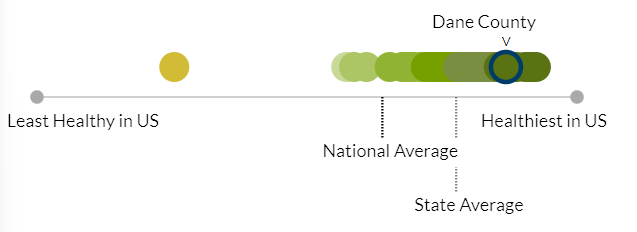
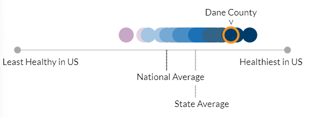
Within each County Health Snapshot there are two graphics displaying summaries of the county’s Population Health and Well-being and Community Conditions. Each county in a state is represented by a dot, placed on a continuum from least healthy to healthiest in the nation. The color of each dot represents Health Groups, our data-informed groupings of counties nationwide with similar Community Conditions or Population Health and Well-being. States may or may not have counties that fall within each of the Health Groups across the range of health nationally.
These graphics indicate how a county fares relative to other counties in the state. They also allow you to see how counties in a state fare on a national continuum of health. Health Groups support data-informed comparisons and a focus on meaningful similarities that can support action but do not necessarily represent statistically significant differences in county health.
Measure details
County Health Snapshots present county, state, and national values for each measure, along with definitions, methods, and limitations based on our population health model. When available, trend graphs illustrate changes in measure values over time.
The default display shows data for the 29 Select measures used to calculate the Population Health and Well-being (5 measures) and Community Conditions (24 measures) summaries.
Basic details are included with each measure to help interpret the data, including the following elements:
| Measure definition | A brief description of the measure. It typically includes information about the units of measure. Some measures are presented as percentages, while others are rates or ratios. |
| Sensemaking statement | A statement that puts the county value into context and further defines more complicated measures. Depending on the measure, it may use less technical terms or provide a benchmark such as a standard or a national average to help interpret the county value. |
| Error margin | Where possible, we provide the error margins (95% confidence intervals) for the county measure values. These error margins should be interpreted as "we are 95% confident that the true measure value for this county lies within the provided range." |
| Years of data used | The year(s) on which the measure value is based. Note that most data collection (via census or survey) has lag times. Our dataset includes the most recent, reliable data we can access but does not represent data from the current year. For example, our dataset incorporates data from the US census, which is updated every 10 years. |
Trend graphs
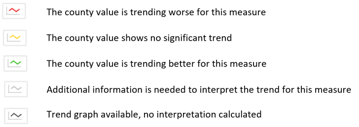
Trend graphs are available for 16 measures. These graphs allow you to examine changes in that measure over time for your county, state or the nation.
To view graphs, click on the graph icon in the Trend column of the Health Snapshot. The color of the line in the icon shows the direction of the measure trend as shown to the right.
Trend graphs can be downloaded. Trend data is also available in downloadable table format in snapshots. Download our guide to interpreting trend graphs for additional information.
Disaggregated data
For some measures, within the County Health Snapshot, we provide data disaggregated to represent racialized groups of people.
Disaggregation means breaking data down into smaller, meaningful subgroups. Disaggregated data are often broken down by characteristics of people or where they live. Disaggregated data can reveal inequities that are otherwise hidden, allow us to better understand where people and places are cut off from opportunities to be healthy and illuminate how communities can target resources where they are most needed.
Where available, disaggregated data are available as a downloadable table from the county snapshot.
Learn more about how CHR&R shares available data to understand the health of racialized groups of people.
Additional data tools
Beyond County Health Snapshots, explore interactive data tools to investigate spatial data and comparisons. Each of these tools provide download options for full datasets or graphics.
State Health Snapshots

State Health Snapshots illustrate geographic variation in measures of health to help you better understand the health of your county within the context of your state.
Resources that can be found on each State Health Snapshot include:
- Interactive downloadable maps for each measure
- State-level demographic data
- Downloadable data tables for each measure
Interactive maps
Place can be a strong predictor of health and maps are a powerful way to view spatial patterns in Population Health and Well-being and Community Conditions. We provide a range of data visualizations that enable comparisons across regions and the nation.
All maps are downloadable.
National map
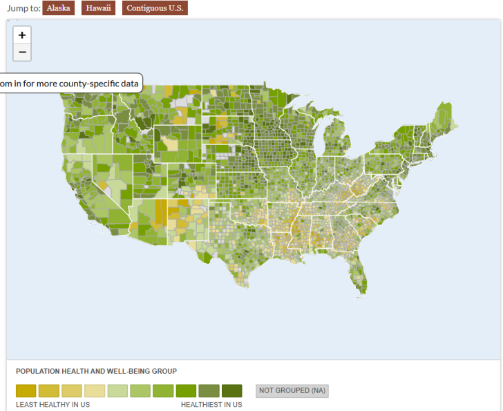
Our national map displays both Population Health and Well-being and Community Conditions Health Groups for nearly all counties in the country. This tool visualizes regional patterns and demonstrates where past and present laws, policies and practices have shaped the conditions for health in ways that remain visible in the national distribution of health and well-being.
State maps
Interactive and downloadable maps are available for each measure on State Health Snapshots. These maps can be used to advocate for the improvement of the health of all people by emphasizing and communicating place-based health disparities.
Congressional maps
On each State Health Snapshot, users have the option to overlay congressional districts on the Population Health and Well-being and Community Conditions maps.
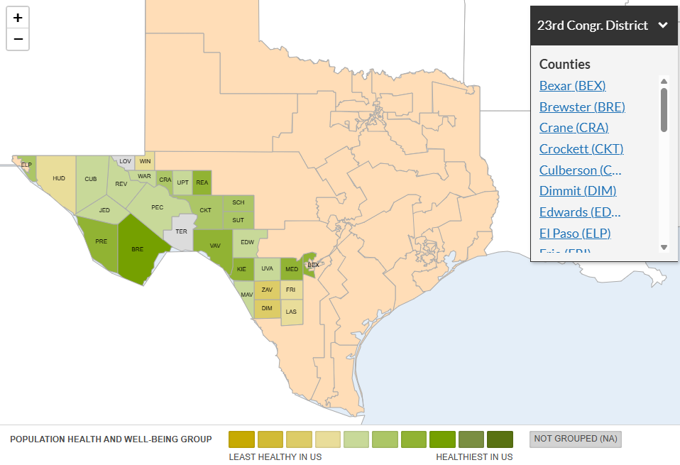
Selecting the Congressional District Lines checkbox below the map shows all congressional districts for your state and the counties associated with each district.
Many congressional districts have counties among the healthiest and least healthy. Visualizing health differences within a congressional district can be a useful tool to communicate geographic disparities with community organizers, elected officials and other decision-makers. This information can be useful to improve health for all by identifying areas of high need and determining where to prioritize funding.
Compare Counties
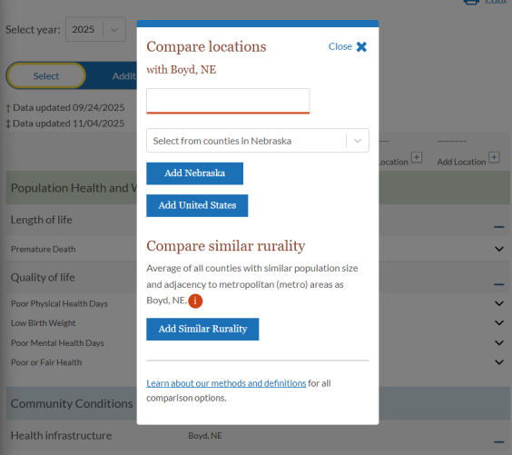
Our Compare Counties tool offers several options for comparing a county to other locations and can be accessed from the bottom of any State or County Health Snapshot. This tool provides a useful way to contextualize the health of a particular area and can be used for goal setting, identification of county strengths and areas for improvement, or to learn more about a county’s health experience within the context of similar locations.
Use the Compare Counties tool to compare individual counties or to compare a county to all other counties in the state, nation, or with similar rural or urban characteristics.
Learn more about the methods and definitions for all comparison options used in the Compare Counties tool.
Data downloads & documentation
Find state and national datasets, and information about downloading and saving CHR&R data and resources.