Your Metro stop could determine how well and how long you live
A few Metro stops apart in the Washington D.C. region could mean a striking difference in how well and how long people live. The final installment of the life expectancy map series by researchers at Virginia Commonwealth University (VCU) Center on Society and Health and the Robert Wood Johnson Foundation (RWJF) show us that where people live along the Blue and Orange DC Metro lines could mean vastly shorter life spans.
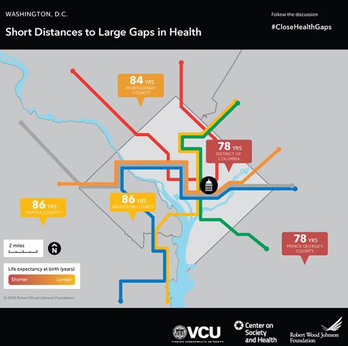
Babies born in the District and Prince George’s County can expect to live 78 years, compared to 86 years just a few stations away in Fairfax and Arlington Counties; babies born in Montgomery County have an average life expectancy of 84 years. The national average is 79 years.
No single factor alone can explain the dramatic differences in life expectancy, but data from the County Health Rankings shows us how short distances can mean big differences in the factors that shape our health. The chart below compares a variety of factors that impact health and how long people live.

The good news is that efforts are underway to tackle these issues. One example is LISC DC. The organization works on several fronts—such as affordable housing, jobs, asset building, early childhood learning, out-of-school-time activity, and adult literacy—to increase the availability of resources and opportunities for good health. Its $50 million Elevating Equity Initiative is aimed at fostering equity, inclusiveness, and improved quality of life in the neighborhoods surrounding DC’s future 11th Street Bridge Park; the park is expected to open by 2019.
The Roadmaps to Health Action Center offers communities many ways to take action to tackle issues that threaten progress and What Works for Health has more than 370 evidence-informed policies, programs, and system changes that communities can explore on range of factors.
Previous maps from Atlanta, Chicago, Cleveland, Denver, Detroit, El Paso, the Inland Northwest, Kentucky, Las Vegas, Miami, Mississippi, New York City, Philadelphia, Phoenix, Richmond, Raleigh/Eastern North Carolina, St. Louis, Trenton, and Tulsa are available here. Join the conversation on Twitter using #CloseHealthGaps.